
vue 实现菜单栏 PC 移动端自动转换
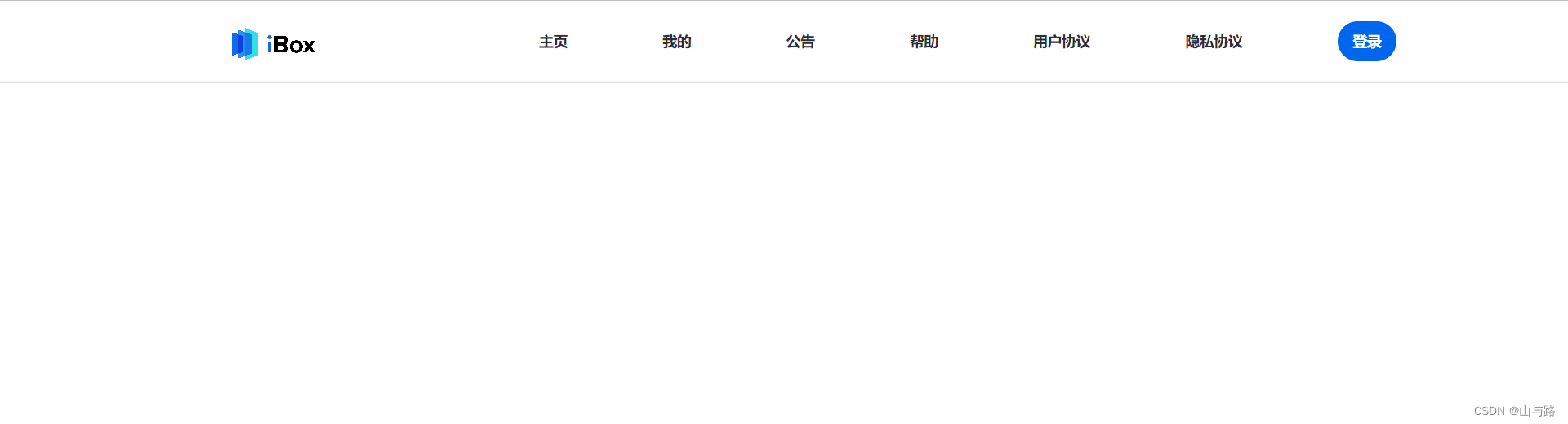
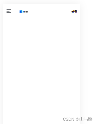
效果图
完整代码
App.vue
<!--
 * @Description:
 * @Version: 1.0
 * @Autor: solid
 * @Date: 2021-11-29 18:28:41
 * @LastEditors: solid
 * @LastEditTime: 2022-07-04 17:16:57
-->
<template>
  <div id="app">
    <HelloWorld />
  </div>
</template>

<script>
import HelloWorld from "./components/HelloWorld.vue";

export default {
  name: "App",
  components: {
    HelloWorld,
  },
  created() {},
  data() {
    return {
      screenWidth: document.body.clientWidth,
      timer: false,
      html: "",
    };
  },
  methods: {
    isMobile() {
      const ua = navigator.userAgent.toLowerCase();
      const t1 =
        /android|webos|iphone|ipad|ipod|blackberry|iemobile|opera mini/i.test(
          ua
        );
      const t2 = !ua.match("iphone") && navigator.maxTouchPoints > 1;
      return t1 || t2;
    },
  },
  mounted() {
    this.html = document.getElementsByTagName("html")[0];
    if (!this.isMobile()) {
      this.html.classList.add("PC");
    }else{
      this.html.classList.add("mobile");
    }
    window.onresize = () => {
      return (() => {
        window.screenWidth = document.body.clientWidth;
        this.screenWidth = window.screenWidth;
      })();
    };
  },
  watch: {
    screenWidth(val) {
      // 为了避免频繁触发resize函数导致页面卡顿,使用定时器
      if (!this.timer) {
        if (!this.isMobile()) {
          this.html.classList.remove("PC");
          this.html.classList.add("mobile");
          return;
        }
        // 一旦监听到的screenWidth值改变,就将其重新赋给data里的screenWidth
        this.screenWidth = val;
        this.timer = true;
        setTimeout(() => {
          this.html.classList.remove("mobile");
          this.html.classList.add("PC");
          this.timer = false;
        }, 50);
      }
    },
  },
};
</script>

<style>
html,
body {
  padding: 0;
  margin: 0;
}
#app {
  padding: 0;
  margin: 0;
}
</style>
HelloWorld.vue
<!--
 * @Description:
 * @Version: 1.0
 * @Autor: solid
 * @Date: 2021-11-29 18:28:41
 * @LastEditors: solid
 * @LastEditTime: 2022-07-04 17:49:19
-->
<template>
  <div class="header">
    <div class="header-fixed">
      <div class="header-inner">
        <div class="header-left">
          <router-link
            class="header-left-logo"
            to="/index"
            tag="div"
          ></router-link>
          <div class="header-left-menu">
            <div class="menu-icon" @click="openMenu">
              <img :src="'https://www.ibox.art/zh-cn/static/img/5de48f4.v1656490708425.svg'" alt="" style="width:30px;height:30px">
            </div>
            <div class="menu-logo" />
          </div>
        </div>
        <div class="header-right">
          <router-link
            class="header-right-text"
            :to="item.href"
            tag="div"
            v-for="item in menuList"
            :key="item.title"
            >{{ item.title }}</router-link
          >
          <div class="header-right-login">登录</div>
        </div>
      </div>
    </div>
    <div class="popup">
      <div class="popup-mask-layer" @click="show = false" v-show="show"></div>
      <div class="popup-body" :class="show ? 'popup-show' : 'popup-hidden'">
        <div class="popup-content">
          <div class="menu-sidebar">
            <div class="menu-item" v-for="item in menuList" :key="item.title">
              <router-link :to="item.href" tag="span" @click.native="toLink">{{
                item.title
              }}</router-link>
            </div>
          </div>
        </div>
      </div>
    </div>
  </div>
</template>

<script>
export default {
  data() {
    return {
      show: false,
      menuList: [
        {
          title: "主页",
          href: "/index",
        },
        {
          title: "我的",
          href: "/mine",
        },
        {
          title: "公告",
          href: "/notice",
        },
        {
          title: "帮助",
          href: "/help",
        },
        {
          title: "用户协议",
          href: "/UserInstructions",
        },
        {
          title: "隐私协议",
          href: "/privacyPolicy",
        },
      ],
    };
  },
  methods: {
    openMenu(){
      this.show = true;
    }
  },
  mounted() {},
};
</script>

<style scoped>
.header {
  width: 100%;
  height: 60px;
}
.header-fixed {
  height: 80px;
  width: 100%;
  position: fixed;
  top: 0;
  left: 0;
  right: 0;
  padding: 0 15px;
  border-bottom: 1px solid rgba(199, 187, 237, 0.5);
  z-index: 10071;
  background: #fff;
  box-sizing: border-box;
}
.PC .header-inner {
  width: 1200px;
  height: 100%;
  display: flex;
  justify-content: space-between;
  align-items: center;
  margin: 0 auto;
}
.PC .header-left-logo {
  width: 200px;
  height: 100px;
  background: url("https://www.ibox.art/zh-cn/static/img/8bfeda1.v1656490708425.png")
    no-repeat;
  background-size: cover;
  cursor: pointer;
}
.PC .header-right {
  width: 70%;
  display: flex;
  justify-content: space-between;
  font-weight: 700;
  font-size: 14px;
  align-items: center;
}
.PC .header-right-text {
  color: #2c2c34;
  cursor: pointer;
  font-size: 14px;
}
.PC .header-right-login {
  background: #0066ed;
  border: none;
  padding: 10px 15px;
  -webkit-border-radius: 20px;
  -moz-border-radius: 20px;
  border-radius: 20px;
  font-size: 14px;
  color: #fff;
  white-space: nowrap;
  cursor: pointer;
}
.PC .router-link-active {
  color: #0066ed;
}

.PC .popup {
  display: none;
}
.PC .header-left-menu{
  display: none;
}
</style>
<style scoped>
.mobile .header-right-text{
  display: none;
}
.mobile .header-inner{
  display: flex;
  align-items: center;
  justify-content: space-between;
  height: 80px;
  background-color: #fff;
}
.mobile .header-left-menu{
  display: flex;
  align-items: center;
}
.mobile .menu-logo {
  margin-left: 10px;
  width: 120px;
  height: 60px;
  background: url("https://www.ibox.art/zh-cn/static/img/8bfeda1.v1656490708425.png") no-repeat;
  background-size: contain;
}
 .popup {
  flex: 1;
  transition: all 350ms;
}
.popup-mask-layer {
  transition-property: opacity;
  transition-duration: 350ms;
  transition-timing-function: ease-out;
  position: fixed;
  inset: 0px;
  z-index: 10070;
  background-color: rgba(0, 0, 0, 0.5);
}
.popup-body {
  transition-duration: 300ms;
  transition-timing-function: ease-out;
  transition-property: transform, -webkit-transform;
  z-index: 10075;
  position: fixed;
  display: flex;
  left: 0px;
  bottom: 0px;
  top: 0px;
}
.popup-content {
  background-color: #fff;
  position: relative;
  margin-top: 64px;
  overflow: auto;
  flex: 1 1 0%;
}
.menu-sidebar {
  padding: 10px;
}
.menu-item {
  width: 150px;
  height: 60px;
  display: flex;
  flex-direction: row;
  justify-content: flex-start;
  align-items: center;
  border-bottom: 1px solid #ebebeb;
}
.menu-item > span {
  margin-left: 11px;
}
.popup-show {
  transform: translateX(0);
}

.popup-hidden {
  transform: translateX(-100%);
}
.router-link-active {
  color: #0066ed;
}
</style>
版权声明:本文内容由互联网用户自发贡献,该文观点仅代表作者本人。本站仅提供信息存储空间服务,不拥有所有权,不承担相关法律责任。如发现本站有涉嫌侵权/违法违规的内容, 请发送邮件至 举报,一经查实,本站将立刻删除。
文章由极客之音整理,本文链接:https://www.bmabk.com/index.php/post/61512.html

