
前言:
目前前端流行的绘制图表工具,不外乎 Echarts、antV、Highcharts、D3;这里主要介绍 Echarts 用于 React及其生态圈的应用,记住如何使用即可,其他框架也大体相同
step 1: 安装 Echarts
npm install –save echarts
npm install –save echarts-for-react
一般来说,echarts-for-react 是 基于 echarts 包的,故要按顺序安装
step 2:官网找你要的图表
在 官网示例 中找到一个图表,我这里找了 堆叠面积图
将 代码编辑栏 的 option 对象复制下来
const option = {
  title: {
    text: 'Stacked Area Chart'
  },
  tooltip: {
    trigger: 'axis',
    axisPointer: {
      type: 'cross',
      label: {
        backgroundColor: '#6a7985'
      }
    }
  },
  legend: {
    data: ['Email', 'Union Ads', 'Video Ads', 'Direct', 'Search Engine']
  },
  toolbox: {
    feature: {
      saveAsImage: {}
    }
  },
  grid: {
    left: '3%',
    right: '4%',
    bottom: '3%',
    containLabel: true
  },
  xAxis: [
    {
      type: 'category',
      boundaryGap: false,
      data: ['Mon', 'Tue', 'Wed', 'Thu', 'Fri', 'Sat', 'Sun']
    }
  ],
  yAxis: [
    {
      type: 'value'
    }
  ],
  series: [
    {
      name: 'Email',
      type: 'line',
      stack: 'Total',
      areaStyle: {},
      emphasis: {
        focus: 'series'
      },
      data: [120, 132, 101, 134, 90, 230, 210]
    },
    {
      name: 'Union Ads',
      type: 'line',
      stack: 'Total',
      areaStyle: {},
      emphasis: {
        focus: 'series'
      },
      data: [220, 182, 191, 234, 290, 330, 310]
    },
    {
      name: 'Video Ads',
      type: 'line',
      stack: 'Total',
      areaStyle: {},
      emphasis: {
        focus: 'series'
      },
      data: [150, 232, 201, 154, 190, 330, 410]
    },
    {
      name: 'Direct',
      type: 'line',
      stack: 'Total',
      areaStyle: {},
      emphasis: {
        focus: 'series'
      },
      data: [320, 332, 301, 334, 390, 330, 320]
    },
    {
      name: 'Search Engine',
      type: 'line',
      stack: 'Total',
      label: {
        show: true,
        position: 'top'
      },
      areaStyle: {},
      emphasis: {
        focus: 'series'
      },
      data: [820, 932, 901, 934, 1290, 1330, 1320]
    }
  ]
};
写入一个自定义函数中,如
const getOptions = () => { return option }
step 3:用 import ReactEcharts from 'echarts-for-react' 中的 ReactEcharts 组件结合 option 属性引入你要渲染的DOM即可
完整代码如下(这里是ts)
import React, { useState, useEffect, useCallback, useMemo, FC, useRef } from 'react';
import * as charts from 'echarts';
import ReactEcharts from 'echarts-for-react';
import './index.less';
type EChartsOption = charts.EChartsOption;

const EchartsTest: FC = (props) => {
  const getOption = () => {
    const option: EChartsOption = {
      title: {
        text: 'Stacked Area Chart',
      },
      tooltip: {
        trigger: 'axis',
        axisPointer: {
          type: 'cross',
          label: {
            backgroundColor: '#6a7985',
          },
        },
      },
      legend: {
        data: ['Email', 'Union Ads', 'Video Ads', 'Direct', 'Search Engine'],
      },
      toolbox: {
        feature: {
          saveAsImage: {},
        },
      },
      grid: {
        left: '3%',
        right: '4%',
        bottom: '3%',
        containLabel: true,
      },
      xAxis: [
        {
          type: 'category',
          boundaryGap: false,
          data: ['Mon', 'Tue', 'Wed', 'Thu', 'Fri', 'Sat', 'Sun'],
        },
      ],
      yAxis: [
        {
          type: 'value',
        },
      ],
      series: [
        {
          name: 'Email',
          type: 'line',
          stack: 'Total',
          areaStyle: {},
          emphasis: {
            focus: 'series',
          },
          data: [120, 132, 101, 134, 90, 230, 210],
        },
        {
          name: 'Union Ads',
          type: 'line',
          stack: 'Total',
          areaStyle: {},
          emphasis: {
            focus: 'series',
          },
          data: [220, 182, 191, 234, 290, 330, 310],
        },
        {
          name: 'Video Ads',
          type: 'line',
          stack: 'Total',
          areaStyle: {},
          emphasis: {
            focus: 'series',
          },
          data: [150, 232, 201, 154, 190, 330, 410],
        },
        {
          name: 'Direct',
          type: 'line',
          stack: 'Total',
          areaStyle: {},
          emphasis: {
            focus: 'series',
          },
          data: [320, 332, 301, 334, 390, 330, 320],
        },
        {
          name: 'Search Engine',
          type: 'line',
          stack: 'Total',
          label: {
            show: true,
            position: 'top',
          },
          areaStyle: {},
          emphasis: {
            focus: 'series',
          },
          data: [820, 932, 901, 934, 1290, 1330, 1320],
        },
      ],
    };
    return option;
  };
  return (
    <>
      <div>
        <div style={{ width: '50%', margin: '100px auto' }}>
          <ReactEcharts option={getOption()} />
        </div>
      </div>
    </>
  );
};

export default EchartsTest;
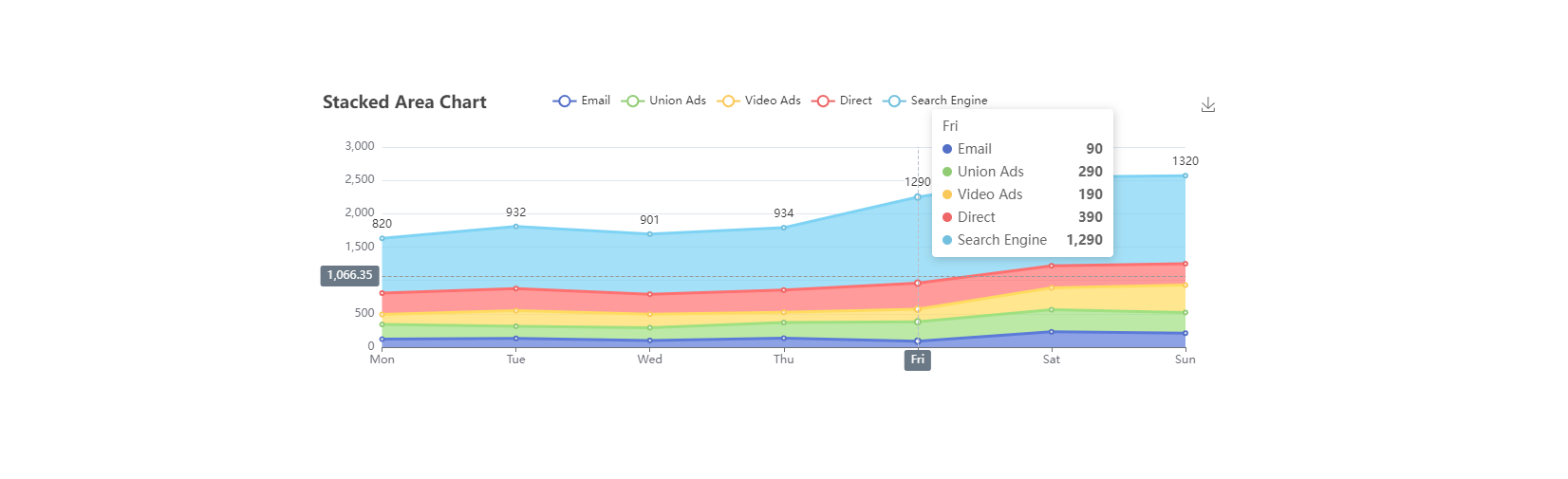
最终效果
step 4:只需将图表里面的数据换成你的即可
如不需要部分图表右上角的下载按钮,注释掉 option 的 toolbox 部分即可
版权声明:本文内容由互联网用户自发贡献,该文观点仅代表作者本人。本站仅提供信息存储空间服务,不拥有所有权,不承担相关法律责任。如发现本站有涉嫌侵权/违法违规的内容, 请发送邮件至 举报,一经查实,本站将立刻删除。
文章由极客之音整理,本文链接:https://www.bmabk.com/index.php/post/64477.html